Tre's A2 blog
Monday, 12 February 2018
Q1)In what ways does your media product use, develop or challenge forms and conventions of real media products?
https://prezi.com/view/Y3kgNSZXpLA93O71Ai4L/
Q2) How effective is the combination of your main product and ancillary texts?
As
a package, the combination of my main product and ancillary text were
successful due to the use of similar house style,content, imagery, tone/ and
language. House style refers to the specific usage and editing conventions
followed by writers and editors to ensure stylistic consistency.
The poster and the CD cover utilise the idea of house style
in order to show the direct relation between both products however I think that
the music video focuses more on the relationship and narrative which is
different to the poster and cd to an extent as the mood and tone of the cd and
poster are more dark and uses this blue to connote mystery and a club vibe.
It is conventional that my main product and ancillary text work together well as a package. In order for my advertising to be successful. As promotional artifacts each compliment eachother well due to the house style keeping the consistancy between text.
The content that I used in the music video is slightly different to the content I used for the cd cover and poster. I used the same image of Ty the artist in the bath tub whilst smoking, I wanted to keep the cd cover and the poster the same as I feel like they are on the same platform whereas the music video is soley alone. In regards to the star quality and image The artist identity is more like the individual in the poster and Cd cover whilst the person in the music video is a character within a constructed narrative.
It is conventional that my main product and ancillary text work together well as a package. In order for my advertising to be successful. As promotional artifacts each compliment eachother well due to the house style keeping the consistancy between text.
However I decided to use this idea to give my artist a well known name and priestige in order for him to stand out. Drake also uses a picture rather than including his name and relies on the picture of his album “views”. The album includes iconography of Toronto, this is a successful marketing technique as individuals would want to know why Drake used this specific image and highlights the importance of his hometown.
Personally, I believe that my products would be successful
within the real world due to how well they each compliment one another. I feel like the poster and cd cover are both
visually appealling and unorthidox. In order to further promote my work In the real world I would create a challange that individuals have to dance to the song (#signchallenge) this will increase the social interaction between fans and artist as well as further promote the song.
Wednesday, 24 January 2018
Sunday, 17 December 2017
inside panels
I decided to use an image I took of my artist in front of a sky with clouds whilst looking serious. I decided on this image as its different from the front and back of the CD cover, however, I kept the blue and the overall house design within the clouds.

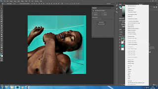
I then started on my inside panels of the CD cover I knew that I wanted the album cover to be similar to the picture on the front cover in order to keep the house style the same. I decided to learn how to place an Image of the artist on an object using photoshop.

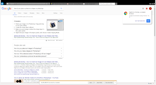
I learnt how to place pictures within object via google;
- Paste your image in to Photoshop. Drag and drop or use Open dialog.
- Create the shape layer (ellipse).
- Make sure your image is above the shape layer in the Layers panel.
- Right click your image in the layers panel, and choose Create Clipping Mask
Friday, 15 December 2017
continuation of editing the CD covers
I added white font which says "TY THE ARTIST" then below I placed the single name sign with features from Mura Masa and IAMDDB, I then added the conventions of a barcode and the copyright licencing.
I decided to remove the red writing and replace it with a simplistic large spaced out white writing. As the image is very iconic hence why I got rid of any other colour which becomes distracting. I also removed the TY as it was also distracting however I changed the position of the title and placed it above the artist head
Wednesday, 13 December 2017
Creating the spine
From the examples I observed it is evident that the conventions of CD spines is the name of the artist, name of song, cd number and record label name/logo.
It was easy to create the spine due to it being very simplistic to create. I knew the font and the colour scheme due to the creation of the front and back cover. I added the OVO SOUND logo due to the song being owned and produced by them.
Subscribe to:
Comments (Atom)


