Sunday, 17 December 2017

inside panels

I decided to use an image I took of my artist in front of a sky with clouds whilst looking serious. I decided on this image as its different from the front and back of the CD cover, however, I kept the blue and the overall house design within the clouds.
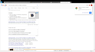


I then started on my inside panels of the CD cover I knew that I wanted the album cover to be similar to the picture on the front cover in order to keep the house style the same. I decided to learn how to place an Image of the artist on an object using photoshop.
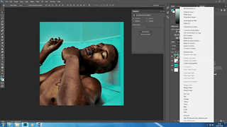


I learnt how to place pictures within object via google;
  1. Paste your image in to Photoshop. Drag and drop or use Open dialog.
  2. Create the shape layer (ellipse).
  3. Make sure your image is above the shape layer in the Layers panel.
  4. Right click your image in the layers panel, and choose Create Clipping Mask 


It worked and went to the right size I wanted it to be I decided to use a similar image to the front cover as well as use the same shade of blue.

Friday, 15 December 2017

continuation of editing the CD covers

I added white font which says "TY THE ARTIST" then below I placed the single name sign with features from Mura Masa and IAMDDB, I then added the conventions of a barcode and the copyright licencing. 


 I decided to remove  the red writing and replace it with a simplistic large spaced out white writing. As the image is very iconic hence why I got rid of any other colour which becomes distracting. I also removed the TY as it was also distracting however I changed the position of the title and placed it above the artist head 

Wednesday, 13 December 2017

Creating the spine

Today I decided to make the spine of my CD I started by looking at images of spines of CD's.
From the examples I observed it is evident that the conventions of CD spines is the name of the artist, name of song, cd number and record label name/logo.


It was easy to  create the spine due to it being very simplistic to create. I knew the font and the colour scheme due to the creation of the front and back cover. I added the OVO SOUND logo due to the song being owned and produced by them.

Tuesday, 12 December 2017

cd cover front and back

I decided to start on my back cover. I used the same colour blue on the back and the front of my CD. I wanted to create boarders around the CD cover so I used the artist name  "TY THE ARTIST". I wanted the font to be simplistic hence why I used the defult font. 


I then started with the front cover. I used the images I took and edited via instagram to tint the overall images however I also used a blue light bulb whilst taking pictures. I then added the word signs. I changed the colour of the font to red as it stood out in front of the blue. I added the name TY as a representation of the artist however I feel like it complicates the cover.

Monday, 11 December 2017

Setting up the cd and poster on photoshop


Related image
Today I decided to set up my pages for creating the cd cover. The software that I am going to use to create the cd cover is photoshop. Photoshop is Adobe's photo editing, image creation and graphic design software. The software provides many image editing features for raster (pixel-based) images as well as vector graphics.

I started to set up the individual panels of the work as I wanted to work on the piece by piece rather than on one document. 


I then set up the pages and created a front cover , back cover , inside left inside right and a spine. I had to change the pages to fit the required sizes which I found on moodle this gave the exact measurements in centimeters 


Thursday, 7 December 2017

feedback for pitch

Pitch feedback 

  • Pro: The writing is clear to read from far because of the font and the colour of the font.
  • Con: The image looks like it has been stretched so it fits in to size.
  • pro: The image I have used a really clear picture and creative 
  • Con: experiement with different font styles for the front cover.
  • pro: I liked the colour scheme (blue) and displays the emotion from the artist 

Friday, 1 December 2017

Research and planning the CD / DVD cover and advert


I have moved on to the ancillary tasks. The task requires me to create a CD cover which needs to include location photography taken during the video shoot an as well as additional studio styled photography. 

Research and planning should include:

  • Case studies (individual work): I need to find three examples of current CD digipacks for existing music promos of similar genres/styles to your own video as well as three accompanying magaziqne adverts for similar digipaks.  Tinfogram / Prezi / google slides/maze / another tech of your 

  • I need to also Produce mock-ups of the advert and the cover.  These should include the use of taglines, cover lines, images and promotional methods. Each member of the group should produce their own mockups, although it is advisable to decide on a house style together.